Branding

Branding

Branding

A brand is a feeling before it is a logo.

A brand is a feeling before it is a logo.

A brand is a feeling before it is a logo.

A brand is a feeling before it is a logo.

OVERVIEW

Every branding project starts with a question that has nothing to do with design. What does this brand need people to feel the moment they encounter it? The answer to that question drives every decision that follows. The mark, the colour, the type, the tone. Nothing is chosen for aesthetic reasons alone. Everything is chosen because it is the most accurate visual translation of an idea worth communicating. Good branding is empathy made visible. It requires understanding a business from the inside, the way its people think about it, the way its customers experience it, and the gap between the two. That gap is where the work begins.

Every branding project starts with a question that has nothing to do with design. What does this brand need people to feel the moment they encounter it? The answer to that question drives every decision that follows. The mark, the colour, the type, the tone. Nothing is chosen for aesthetic reasons alone. Everything is chosen because it is the most accurate visual translation of an idea worth communicating. Good branding is empathy made visible. It requires understanding a business from the inside, the way its people think about it, the way its customers experience it, and the gap between the two. That gap is where the work begins.

01

Céleste is a modern accessories house where heritage meets contemporary refinement, a quiet study in craftsmanship, form, and permanence. Each handbag is meticulously handcrafted, merging the structure of the Gothic with the grace of the Renaissance, where shadow meets light and detail becomes art. Guided by values of artistry, integrity, and sustainability, every piece is created with intention and made to endure beyond passing trends. Céleste embodies quiet confidence and dark feminine elegance, refined yet commanding, timeless yet modern. These are not mere accessories but crafted heirlooms, designed to be carried and cherished for a lifetime.

02

Neurowellness Counselling is a trauma-informed practice rooted in the connection between the brain, body, and nervous system. With a focus on bottom-up regulation and neuro-affirming care, the work supports individuals and families in moving through states of overwhelm, dysregulation, and identity processing toward greater stability and self-understanding. The brand reflects this approach. It is calm, contained, and intentional, designed to act as a visual extension of the therapeutic experience itself while capturing the journey trowards growth and progression. Every element is considered to reduce overwhelm, avoid activation, and communicate a sense of grounded professionalism. Rather than overwhelming with complexity, the identity prioritises clarity, softness, and subtlety, mirroring the process of regulation and restoration.

03

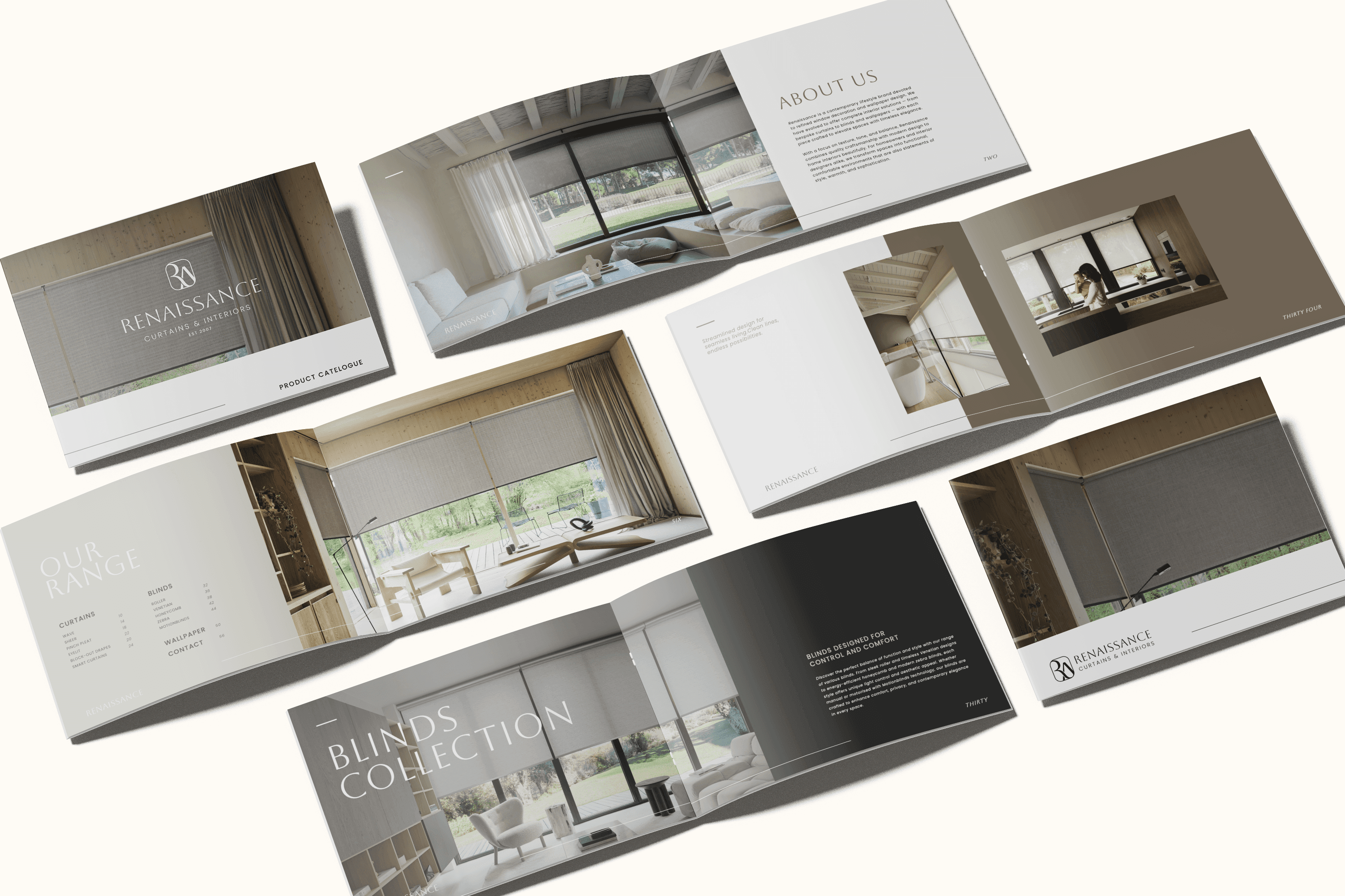
A full brand identity built for the interior design industry, where the brand itself needs to feel as considered as the spaces it helps create. The monogram mark balances a refined serif sensibility with clean geometric structure, creating a logo that speaks the visual language designers and specifiers already trust. The colour story, ivory, charcoal, stone beige, and earth taupe, mirrors the tones of the interiors the brand dresses, ensuring it sits naturally in trade environments, showrooms, and the hands of the clients who care most about how a room feels. The result is a brand that does not need to announce itself. It simply belongs in the room.

04

Stillness at sea, expressed through form. Kenshō drew from Japanese philosophy and art-inspired interiors to create an identity that feels more like a piece of typography than a logo. The letterforms are considered as objects in themselves, organic and architectural at once. Every element, the mark, the type pairing, the colour story, was chosen to reflect a world where design and mindfulness are the same conversation.

05

Sophisticated, powerful, and built for open water. The Victorious identity needed to carry the weight of a premium maritime brand without losing the sense of movement and ambition the name demands. A geometric mark with layered depth, a deep navy palette, and a typographic system that commands attention. The kind of brand that looks as good on the hull of a yacht as it does on a business card.

06

Where adrenaline meets indulgence. Sensation Marine occupies a rare space where high performance water sport culture and luxury nightlife exist in the same brand. The identity had to hold both without compromising either. Bold, driven letterforms sit alongside a sunset gradient palette that shifts from action to atmosphere. Refined by day. Unbound by night. A brand that moves as fast as the lifestyle it represents.

Each project here was built to last, designed to hold up over time, across every touchpoint, every format, and every person who encounters it.
Yours can be too.

Each project here was built to last, designed to hold up over time, across every touchpoint, every format, and every person who encounters it. Yours can be too.

Each project here was built to last, designed to hold up over time, across every touchpoint, every format, and every person who encounters it.
Yours can be too.

Each project here was built to last, designed to hold up over time, across every touchpoint, every format, and every person who encounters it.
Yours can be too.

Each project here was built to last, designed to hold up over time, across every touchpoint, every format, and every person who encounters it.
Yours can be too.

Contact Me

mikayla@ilonotia.com

072 332 9611

Cape Town, South Africa

Contact Me

mikayla@ilonotia.com

072 332 9611

Cape Town, South Africa

Contact Me

mikayla@ilonotia.com

072 332 9611

Cape Town, South Africa

Contact Me

mikayla@ilonotia.com

072 332 9611

Cape Town, South Africa